4 Basic Principles of Design
SITTING DOWN TO YOUR DESK IN THE MORNING and taking on that endless barrage of emails isn't really an anticipated task for many people. Even with Starbucks in hand, few can fight off the haze that comes over their eyes while reading one after the next of the bland and the boring. Sadly, the most visually stimulating part of the typical business email is the signature and company logo at the bottom, which does a great job of drawing your attention right past the content and directly to the end. Not too sure that was the goal.
To make sure people don't hit the snooze button on your work, here are 4 basic design principles to live by. You'll be amazed at the difference a few subtle adjustments can make in impacting your audience and communicating your content with real significance.
1. Contrast
Perhaps the most basic and most eye-catching design principle to apply is contrast. Whether it's creating a presentation or formatting an email, using dramatic differences will draw your audience's eye exactly where you want it to go. Avoid the lukewarm expression of elements being merely similar and choose to present them as substantially different.
In the example to the left, the colors and fonts are too similar. For someone sitting further back during a presentation, it would be difficult for them even to differentiate the word from the background. Not using strong contrast actually has a reverse effect and encourages people to move on to the next thing that catches their eye. The word to the right uses starkly different fonts, colors, and weights demanding attention and making it crisp and easy to read.
2. Repetition
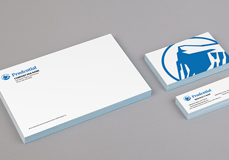
The key to repetition is taking a few visual elements such as colors, shapes, line thicknesses, fonts, etc. and repeating them throughout the design. This unifies your different ideas and creates a strong since of organization. When making a company brochure or business stationary (letterhead, envelopes, business cards) that work harmoniously, repetition will be the principle that brings it all together.
As you can see in this Prudential business stationary, by repeating colors, fonts and the company logo, a uniform and professional look is created. The repetition makes it immediately clear that these pieces are connected, which builds brand significance and recognition for potential clients and colleagues.
3. Alignment
Alignment is the best way to make sure the elements of your work look like they were put together on purpose. If you place content on a page at random, your audience will know. By intentionally aligning each element, you will draw an invisible line that leads their eyes through the flow of your work. Alignment is also key when connecting distant elements on a page by providing a perspective of the bigger picture.
In the business card below, the brand mark and text on the front of the card are aligned in the center to draw focus and establish significance. But, be careful when using center alignment as too much information aligned this way can appear unorganized and cluttered. The back of the card has associated information aligned together such as the name and position as well as all the contact information. This quickly and clearly allows the reader to see the information and understand how it all works together.
4. Proximity
Proximity is all about presenting your content with a clear structure. If you have closely related information, grouping it together will make sure it is viewed as one unit rather than disassociated elements. Organizing information this way will reduce clutter make more sense to your reader. Think about it like this: if you see a family out on a walk, because you see them together, you notice their similarities that show they are related. Just like with a family, putting related elements together will help your reader notice the aspects that connect them more readily.
In the example to the left, notice that none of the information is grouped together making it visually unclear how to process the information. But, by placing "photographers" closely under the names in the example to the right, the reader can immediately identify who the photographers are and why they should be important to them. Placing all the contact information together makes it easier to locate and can act as a subtle "call to action" as the next step in working with you.
Show Rather than Tell
It's true that regardless of how you format your content, the information remains the same. But by using these principles, the content will begin to show its meaning rather than just say it and will communicate a much stronger message to your audience.
What other basic design tips have made a difference for you?
If you have a design principle you would like to add, please do so below.


