3 Things Your Website Needs to Produce Sales
Have you ever looked at your website traffic and wondered why all those people are merely passing through?
I mean, what does it take to get someone who has already done the hard part of finding your website to become a paying customer? It doesn’t take gimmicks or some kind of mysterious magic. You just have to be able to communicate as clearly as possible.
Donald Miller, New York Times bestselling author and CEO of Story Brand, confirms, “People don’t always buy the best products and services. They usually buy the products and services that can be understood the fastest.” That’s all it takes. From the moment someone opens your page, how quickly can you get them to understand what you offer, how it will improve their life and what they need to do to buy it?
Here are three surprisingly simple ways that you can streamline your message and convert views into more sales, which ultimately means more money in your pocket.
Obvious Call to Action
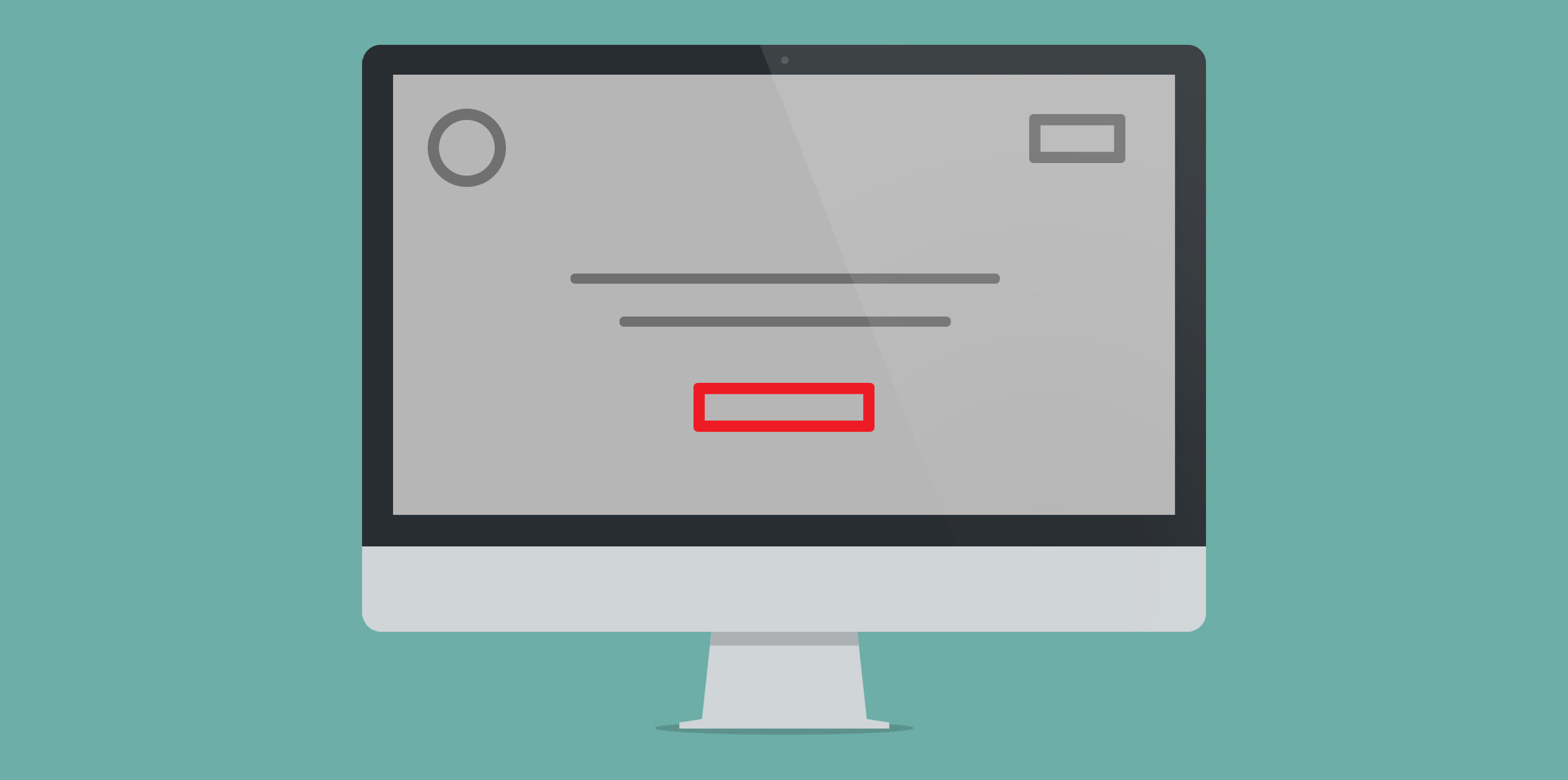
If you are telling people to do more than one thing, I guarantee you’re losing sales. There may be multiple buttons on your home page that direct people to your about page, blog, products, kitten of the week photo, etc. But, you need one direction that intentionally stands out from the rest.
Make it bigger, bolder, use contrasting colors, just make sure it is the first thing that draws their eyes. People don’t want to have to figure out what they are supposed to do on your website, so tell them with a obvious button that leads them to “Buy Now”, “Call Us Today,” “Schedule an Appointment” or whatever it is you need them to do.
Easy to Understand Tagline
If it seems like you aren’t really sure what it is that you do, people on your website aren’t going to hang around long enough to figure it out. You need a clear, overly simple tagline that can sum up what you want to do for them in six words or less. Now, I’m not saying that people are stupid, but I am saying that they’re lazy. They only have so much time and attention to give you, so let them spend that time deciding how much to write the check for rather than deciding if they want to spend any more time trying to understand who you are.
So rather than, “Beauty that works for you,” which honestly means nothing to your potential client, tell them, “We make beautiful websites for you.” Just get to the point and your clients will appreciate you for it.
Success Pictures
Before clicking "Buy Now," customers want to be convinced that your product or service will actually make their lives better. It may shock you to hear, but a small, grainy photo of your company’s building isn’t going to tell them that. So why not show them someone using your product and enjoying it. This will immediately associate your product with a positive emotion and let them see the experience of success that comes with being your customer.
The people visiting your website have some kind of internal conflict, a problem, that you can solve for them. Use these few seconds of their attention to help them see why they need your solution in their lives.
Think of this initial impression as a first date. When you sit down to the table together, you’re not going to tell them everything — about your stubborn toe fungus and that strange uncle with the pet pig. You’re going to give them the highlights. You’re going to tell them just enough to get their interest, and then they will lean in and say, “Tell me more.”


