Surgery Center of the Lakelands

Surgery Center of the Lakelands
An outpatient surgery center gets a facelift
The Situation
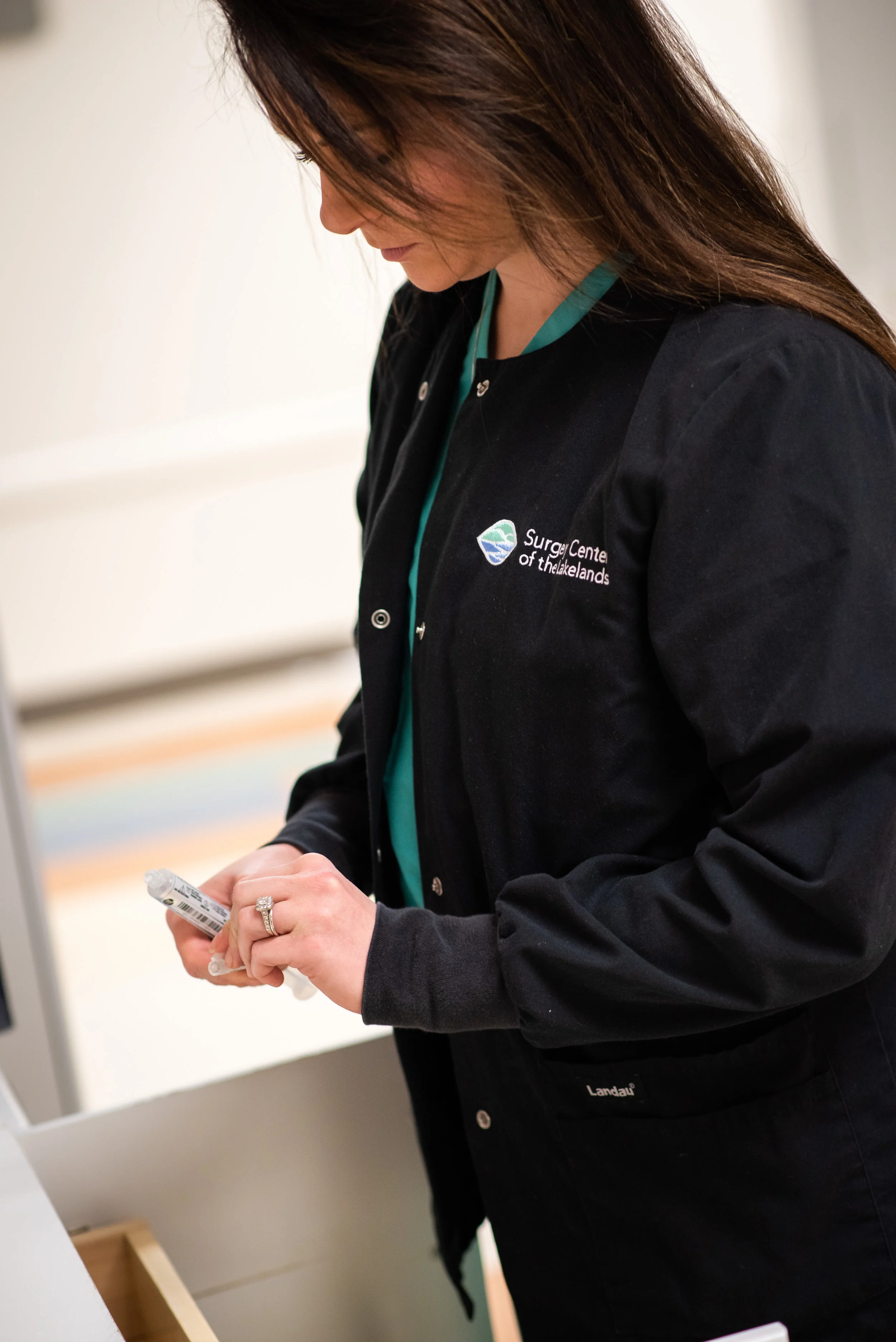
The Surgery Center of the Lakelands is a state-of-the-art outpatient surgical center serving a seven county region surrounding Greenwood, S.C. Rather than simply being one of the many options patients have for surgery, they wanted to be easily identified as a less expensive and more convenient alternative to hospitals.
The solution
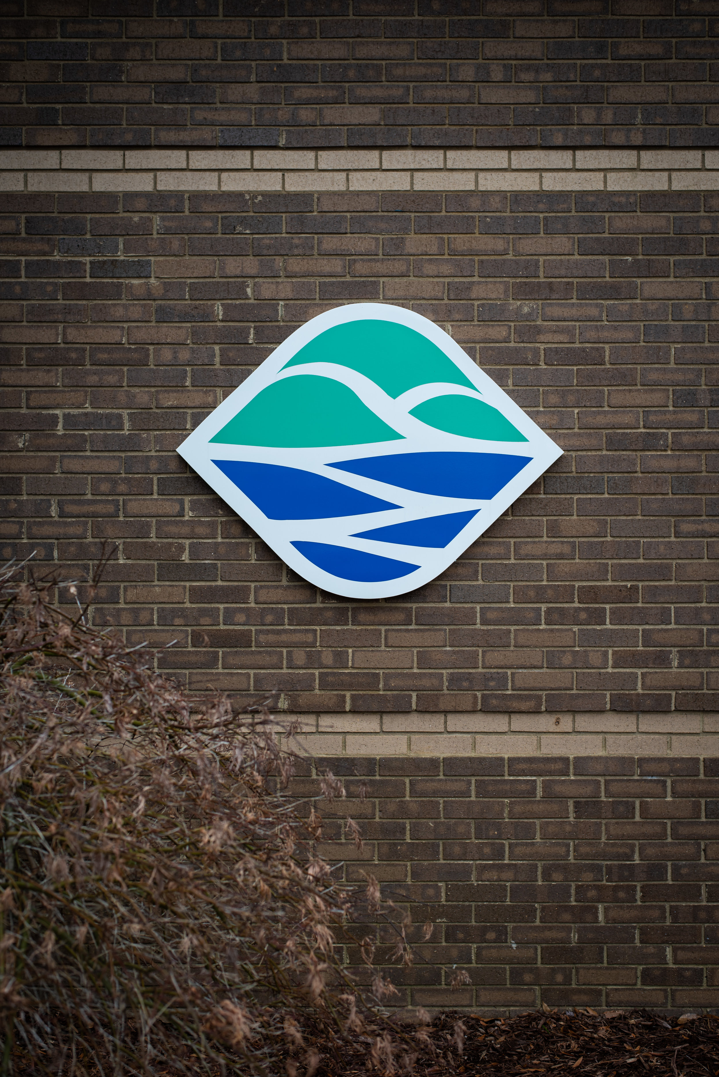
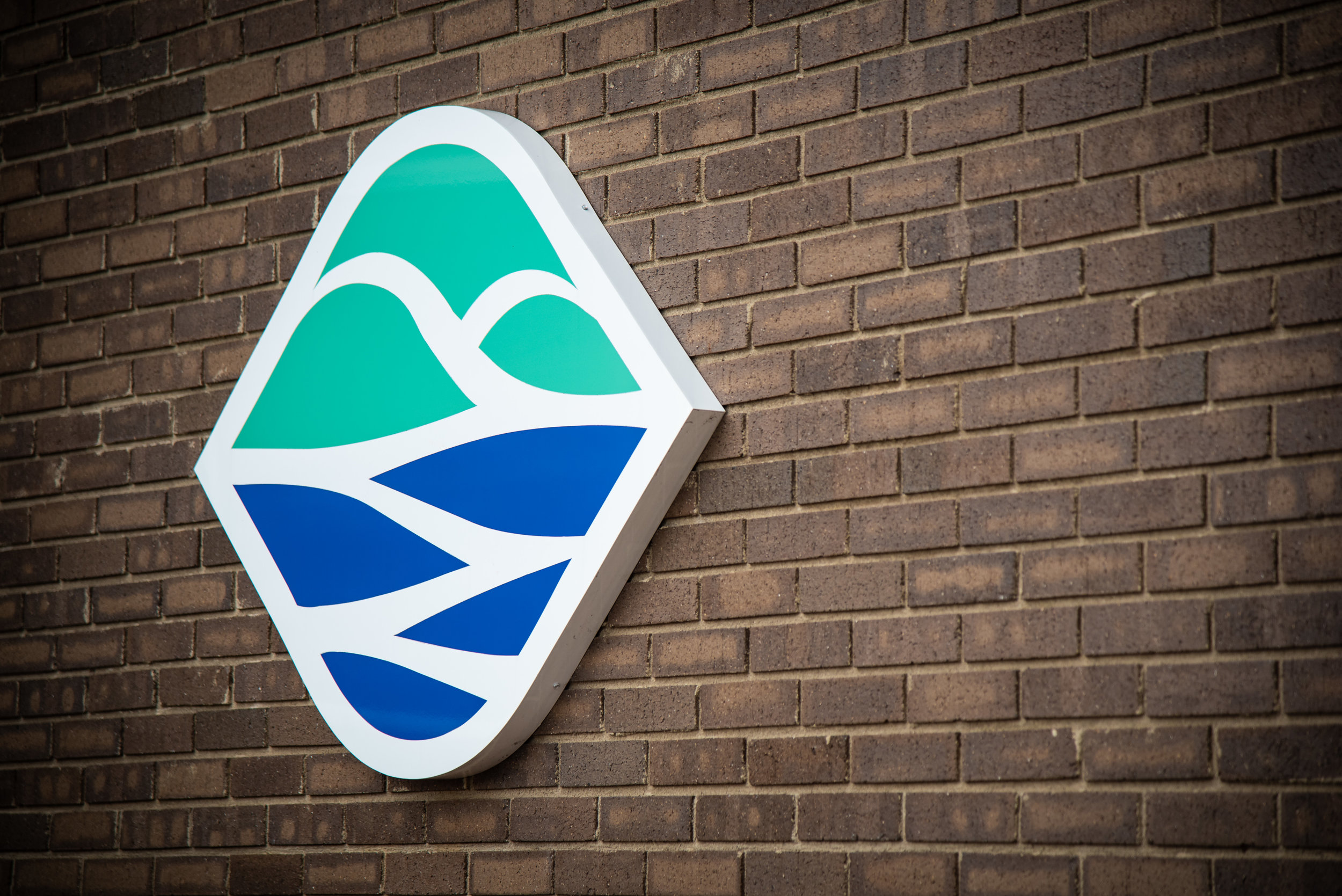
Friendly curves and subtle colors give an approachable yet professional face to this facility. Also, beyond the combination of water (lake) and hills (land), the board wanted a deeper connection to the surrounding community by incorporating the number seven into the design as well. So, seven individual pieces were used to form the brand mark, each representing one of the counties that this center serves.
What we did
Market Research
Logo Development
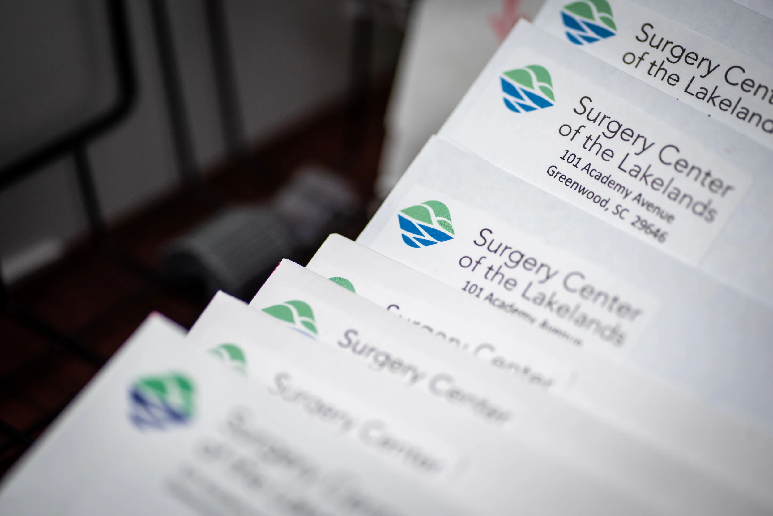
Business Stationary
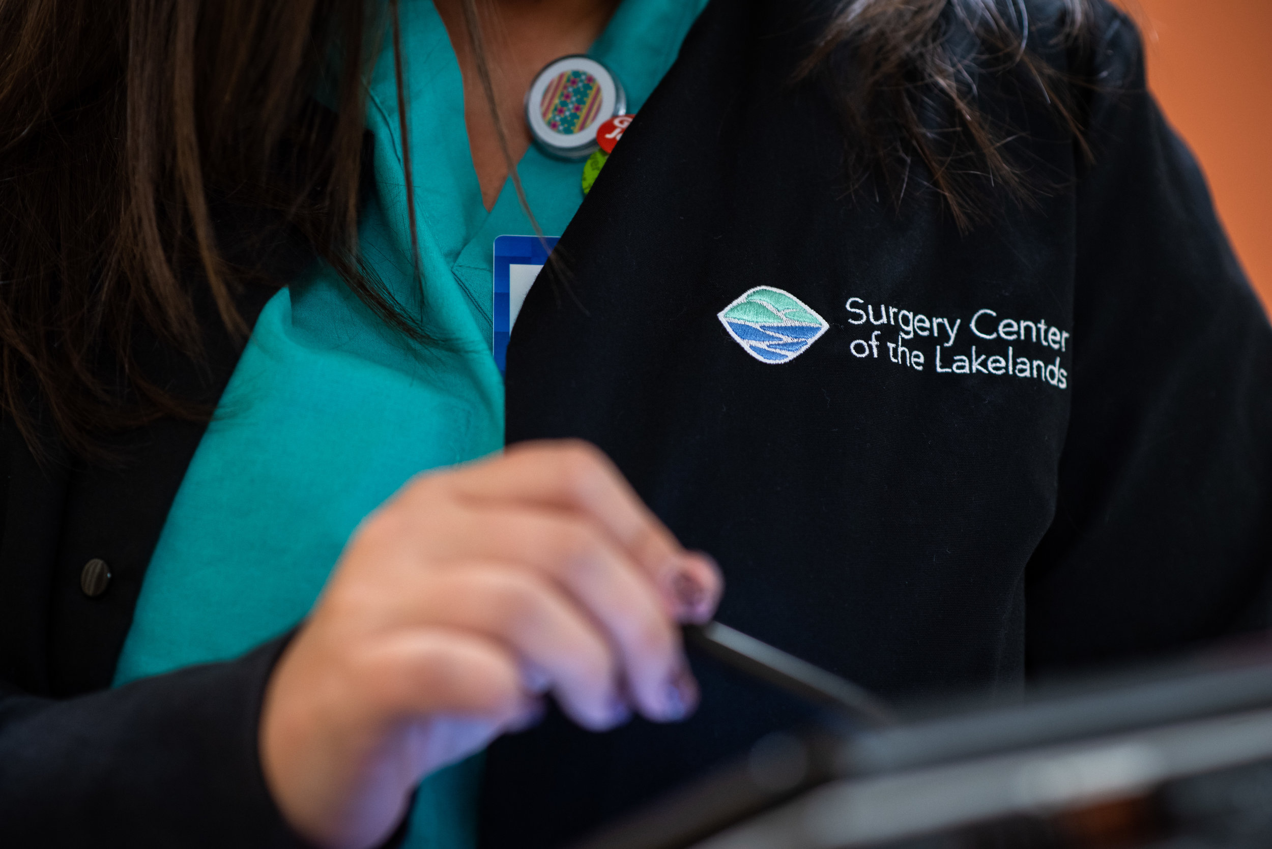
Signage
“After working with a large marketing firm and not feeling like we were getting the personalized service we needed, I was told about Red Bicycle by a friend.
I spoke with Tucker, told him who we were, what service we provided, and the demographic of people we were looking to reach. Within a couple of days, he had created a rebranded logo that surpassed our expectations. I would highly recommend Red Bicycle and Tucker King.”